Florence and the Machine - Ceremonials
This digipack is not only appropriate to the genre but also to Florence herself. The album conforms to the conventions of the indie genre. For example going against mainstream conventions, low key lighting and studio locations.
Florence is an artist who often challenges stereotypes.
Florences skin looks very pale on the cover. This could be to challenge the stereotypes of using fake tan and being tanned. Although she challenges dominant ideologies we can see her skin is still flawless which conforms to the stereotype that women are beautiful but have to have flawless skin to be so.
Her ginger hair stands out in this image. This again challenges ideologies that ginger hair is unacceptable in community.
Her body language is shows her arm across her body and holding herself. This could be to signify that she feels insecure, also her eyes are closed and her head is rested. This could be to express that she need time to herself.
The setting is quite disorientating. It looks like she is leaning on mirrors creating an image that shows her from different angles. This could be to say that she is giving us everything and bearing her all to us but on the other hand it could be to express the music and how it is a reflection of herself .

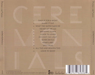
The layout of the front cover is the typical indie layout, artist, artists picture and album title. The font of Florence and the Machine is the same on every album, so she is almost creating her own iconography of her name, so people will be able to recognise her from even the font of writing. The font of Ceremonials is quite abstract and could represent her weirdness.
The detail on the back cover of the album simply has the title in the background and the tracks in the middle going down in order. This is quite a normal track list for Florence but it could be to highlight the very indie convention that only the music matters and not the artist.
Florences image from this album cover is portrayed as very against anything mainstream. Quite mature and sophisticated, from her outfit. Its not a young, in fashion piece.
Lykke Li - Wounded Rhymes

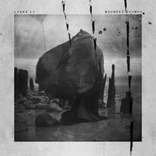
 The front cover conatins all the appropriate information of what we would expect to see upon an album cover, the artist, a picture and the album title. This also conforms the genre conventions, for example black and white effect.
 The location of this album cover is set on a coast. Although it is set on a coast, it is probably not a place we would ever visit with its rock base and pronged drift wood. This could be trying to get the message across that her album is different, probably somewhere you've never been/ something you've never heard before.
Also the image doesn't fill the entire front cover, leaving a gap around the edge, almost making it look like a framed photo. This in itself is a metaphor, "Good enough to frame".
The image colours are black and white, which is extremely conventional for an indie album.
Her choice of costume also is an all black, big outfit, that is blowing in the wind. We often see widows wearing all black. This, to me, looks like a woman mourning, which also fits in with the title of the album, Wounded Rhymes, she is wounded herself. Also the sky is full of clouds so the pathetic fallacy also gives off a depressive, sad atmosphere.
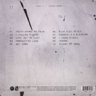
Over the top of all the image is three large scratch wounds, often associated with werewolves, and splatters of what we can only assume to be blood. This also fits in with the title, Wounded in particular. But why would you use a piece of iconography that is associated with a supernatural creature? This also poses the question, who is she? We can't see her in the picture, is it even her? and what is she? This makes her album seem very mysterious and want to listen on to find out the hidden messages behind her lyrics. The back of the album carries on this theme, with one scratch down the back and also a tally chart, what is she counting? Mysterious :O
The front cover is laid out in a different way to what we usually see. The album title and artist are in a small font, above the picture and far apart. I think this is to signify the importance of the content and not the artist herself, only the music matters. The tracklist is laid out in two rows and all in capital letters. I think this is to signify that each song is equally important.
This digipack sells Lykke Li as very mysterious, perhaps spiritual, it is almost as if she is undergoing her own personal mission on the front cover. I don't think Lykke Li is very well known and relies on the images, fonts and layouts to sell her album.
My DigiPack
From my analysis I believe that it is important for my digipack to have one running theme through it. I also believe that a picture of my artists should be on the front cover in the appropriate costumes that best refer to the genre of music we are focusing on, indie.
The image on the front cover will be the two main singers from the band, the two people who we will cast for our music video. I think it would be clever to have the image in black and white but the powders in colour. The powders will be a theme from our music video, in the music video the bright colours of the powders will represent Florence and the Machine so perhaps it could represent her presence in the song on our cover as well. The image on the back cover will be of two hands crossing to make an x. This is important to the band because their symbol/iconography is of an x. The track list can be running down their hand and we can photoshop the writing to make it look like it is tatooed onto the hand. Tatoos are another convention of indie genre. The inside cover will be a picture of the band but you won't be able to see their faces. This is important because we want to try and say that the band members identities don't matter, only the music does. The image on the CD will be of the symbol of the band, an x. It only needs to be simple and memorable.
Our digipack will mainly sell our band to the fans, to those who know what the x means, but it will also be eye catching because of the bright colours mixed with the black and white.
Florence and the Machine

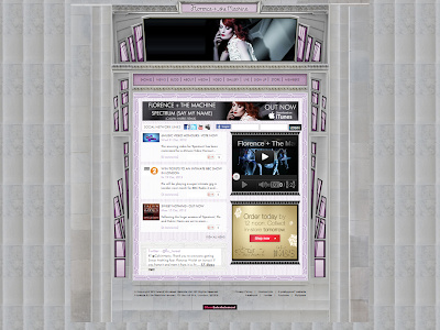
There aren't many pictures of Florence on her web page, just a slide show at the top. This conforms to the indie conventions that image isn't as important as the music.
There are links to social networking sites such as facebook, twitter, myspace and youtube. There is also a live twitter feed at the bottom of the page.
To get onto the website you have an entry screen which advertises her latest concert, so you have to see this before you enter the website. The website has a very simple layout with her name and picture at the top and then a range of options and other information, its just simply one page which changes colour. When you open up her official website the first thing you see is her name, in the same font she always uses for her name and a slideshow of pictures of her underneath. Then underneath you have all the options you expect to see on an artists website, e.g News, Blog, Videos, Gallery, Store, etc and and one of her latest music videos. The layout is as if it is a stained glass window and she is in the middle. This could have a range of connotations. Where do you usually see stained glass windows, at churches, and who is usually on them, holy people. This could suggest that she thinks she is holy. The colours also keep changing which also lead me to believe it was meant to imitate a stained glass window, there are lots of colours on stained glass windows.
The written content consists of latest news on Florence from sources like 4Music and BBC Radio. There isn't alot of writing on the homepage that the audience needs to read, everything is summed up. If you want to read more you can just click on the tabs, depending on what you want to know.
The target audience of the website seems like it would be 16 - 19. Mainly because the layout is quite sophisticated, the changing colours and images give it a very classy look. It doesn't have alot of writing, which is good because people within this age bracket probably won't bother reading massive articles of writing.
There are very few adverts on her web page. She has an advertisement for her songs on itunes, and there is an M&S advert but that's it.
I don't think this does look like an indie pop website let alone a Florence and the Machine website :S
It seems to normal, its got a regular layout, and the colours are very pastel like and it isn't bold enough for Florence and the Machine. I expected from her website, for it to be very interactive with lots of wierd pictures from her videos. It is just not very Florence and doesn't seem like she has had alot of input into it.
There are lots of images. Lots of images of her and her merchandise and the magazines she has been featured on the cover of. All of the images are in black and white following the indie trend.
We can see her genre of music is indie because of the colours, layout and the content of the photos. She doesn't have images of her looking amazing in a bikini, they look like photos she has just took of herself in her back garden, giving it a very small scale and homely feel. The colour scheme of black and white conforms to the indie genre.
There isn't alot of written content, there is mostly pictures representing links to the other pages of her website.The layout is mostly vertical, its a very long page which you can't view all at once. The pictures are very big and take up alot of the space. I think the layout of Lykke Li's website is mostly to show how much work she does, it is also almost like a diary from day one, so it shows her career developing. This could be inspiring for her fans.
There are no official adverts on her web page, only pictures of her merchandise which is sort of advertising but it isnt presented in an advert.
Links to social networking sites such as facebook, twitter and youtube. Also links to not so popular networking sites such as vimeo and spotify. She has more sites to connect too on her website than Florence which tells us that she isn't as popular and has to use a range of networking sites to get to different audiences. You can even listen to her music through the audio player provided on her website.
The target audience for her web page is probably 17 - 19. All the hyperlinks are in one place so it is easy to find them and access them and there is plenty of visual material, because who wants to have to read through loads of writing.


No comments:
Post a Comment