Wednesday, 31 October 2012

Digipack cover research


(Failed to find the insert)
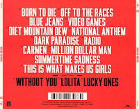
The album matches the genre of the band, since the Ting Tings is an indie pop band, thier music is not going to be soft and light. The bright red coulour catches everyone's eyes, and also hints that the band's music is loud instead of quiet. Because this is the debut album of the band,
it is necessary to make it clear about the band's genre and image through the album's cover.
This debut album also acts as an introduction of the band.
On the cover, there are only two hands holding drumsticks which tells people who don't know them that they are a band and what music instruments audience could expect to hear from their music.
As an introduction, it is important for pop bands to show their iconography on the album,
the Ting Tings chose to show it on the back cover, this means their main focus is still on music,
this is why they don't put their iconography on the cover.

The album uses the style of scrapbook which enriches the cover.
The costumes on the artists even tells their target audience would not be professionals but
middle class to working class, especially students (teenagers)
So their scrapbook style, costumes and the font types used on the covers attract students effectively.
There is no serious, formal font types seen on the cover, so this further suggests the band's target audience.

Overall, the amazing design and cool iconography of the band are the ways they promote the band,
and this very first album is proved to be successful in solidifying the band's image and genre.


(Failed to find the back cover)
Both the cover and the insert match the genre of the band where an irritating image is presented no matter in their music and album design. With the dominant black and white effect throughout the album, it shows the dark image of the band.
Use of photobooth pictures further suggests their genre which is indie rock.
Since those photos are not taken by professional photographers,

Iconography  of the band is seen on the cover, however, the artists cover up their faces with paper and
Alison even holds the papaer with the title of the album on to cover up her eyes.
This means the band is not using their appearnces as their selling point.

Similar to the Ting Tings and the XX, dark outfits like black leather biker, shirts are frequently seen. Locations they take photograph of are also unknown places seem abandoned, isolated.
These are effective in showing the uniqueness of the band's music,
such mise-en-scene could also tempt indie fans easier because they do not like mainstream settings and styles.
 
The albums uses simple bold font on both cover and insert,
this gives an effect of the band's simplicity, it also matches the style of the album design,
no special effects and photographs are included, so is the font.
This creates a casual style of the band which mgiht help selling their music as
urban and rock. These kind of music's usual target audiences are working class or students,
such album digipack design could easily appeal their audiences.
 
3. Our Digipack
The initial idea of our digipack is quite similar to the albums above.
We would like have black as the dominant colour of our digipack which stands out the dark image of the XX. Like the Ting Tings, we would put our band's iconography onto the digipack,
but we would put it on the cover since it is part of our idea apart from selling the appearnces of the band memebers and even make our band more recognisable.
At the back cover, we will have a black and white photograph of palms, I later found this's actually quite similar to the cover of the XX but we are going to use the photograph for another purpose which is more than the introduction of music instruments the band uses.
 
In terms of mise-en-scene, we will use typical costumes like black leather jackets, shirts etc.
This could be quite similar to both the Ting Tings and the Kills.
For shooting location, we tend to do the photographs in an empty room and a band studio where music instruments will all be shooted, this is to consolidate the image of them as a band.
Dim lights will be used for photographs, for the inside sleeve,
we tend to take a black and white photograph of the band with projection on them which is one of the scenes in our music video.
We tend to use simple bold font type like Arial just to keep the image of the band simple.
We are inclined in not showing the face of the band memebers but their side-faces.
This is to drift audiences attention back to their music instead of appearances.
We know it is better for the audience to be attracted by their appearances, that is why we put the band memebers' iconography on the cover just to make an incredible first impression.
But one's interest simply caused by appearances is not going to last long,
and this is why we don't want audiences to put too much focus on our band's appearance.
Of course the band's costume could help attracting audeinces as well.

Monday, 29 October 2012

DigiPack Cover Research


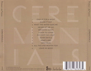
Florence and the Machine - Ceremonials


This digipack is not only appropriate to the genre but also to Florence herself. The album conforms to the conventions of the indie genre. For example going against mainstream conventions, low key lighting and studio locations. 

Florence is an artist who often challenges stereotypes.
Florences skin looks very pale on the cover. This could be to challenge the stereotypes of using fake tan and being tanned. Although she challenges dominant ideologies we can see her skin is still flawless which conforms to the stereotype that women are beautiful but have to have flawless skin to be so. 
Her ginger hair stands out in this image. This again challenges ideologies that ginger hair is unacceptable in community.
Her body language is shows her arm across her body and holding herself. This could be to signify that she feels insecure, also her eyes are closed and her head is rested. This could be to express that she need time to herself. 
The setting is quite disorientating. It looks like she is leaning on mirrors creating an image that shows her from different angles. This could be to say that she is giving us everything and bearing her all to us but on the other hand it could be to express the music and how it is a reflection of herself .

The layout of the front cover is the typical indie layout, artist, artists picture and album title. The font of Florence and the Machine is the same on every album, so she is almost creating her own iconography of her name, so people will be able to recognise her from even the font of writing. The font of Ceremonials is quite abstract and could represent her weirdness. 
The detail on the back cover of the album simply has the title in the background and the tracks in the middle going down in order. This is quite a normal track list for Florence but it could be to highlight the very indie convention that only the music matters and not the artist. 
Florences image from this album cover is portrayed as very against anything mainstream. Quite mature and sophisticated, from her outfit. Its not a young, in fashion piece. 


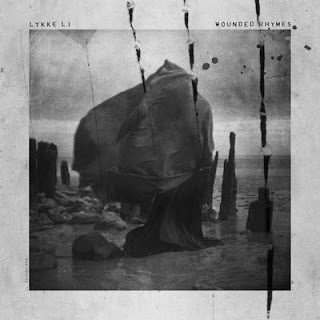
Lykke Li - Wounded Rhymes

The front cover conatins all the appropriate information of what we would expect to see upon an album cover, the artist, a picture and the album title. This also conforms the genre conventions, for example black and white effect. 
The location of this album cover is set on a coast. Although it is set on a coast, it is probably not a place we would ever visit with its rock base and pronged drift wood. This could be trying to get the message across that her album is different, probably somewhere you've never been/ something you've never heard before. 
Also the image doesn't fill the entire front cover, leaving a gap around the edge, almost making it look like a framed photo. This in itself is a metaphor, "Good enough to frame". 
The image colours are black and white, which is extremely conventional for an indie album. 
Her choice of costume also is an all black, big outfit, that is blowing in the wind. We often see widows wearing all black. This, to me, looks like a woman mourning, which also fits in with the title of the album, Wounded Rhymes, she is wounded herself. Also the sky is full of clouds so the pathetic fallacy also gives off a depressive, sad atmosphere. 
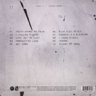
Over the top of all the image is three large scratch wounds, often associated with werewolves, and splatters of what we can only assume to be blood. This also fits in with the title, Wounded in particular. But why would you use a piece of iconography that is associated with a supernatural creature? This also poses the question, who is she? We can't see her in the picture, is it even her? and what is she? This makes her album seem very mysterious and want to listen on to find out the hidden messages behind her lyrics. The back of the album carries on this theme, with one scratch down the back and also a tally chart, what is she counting? Mysterious :O 
The front cover is laid out in a different way to what we usually see. The album title and artist are in a small font, above the picture and far apart. I think this is to signify the importance of the content and not the artist herself, only the music matters. The tracklist is laid out in two rows and all in capital letters. I think this is to signify that each song is equally important. 
This digipack sells Lykke Li as very mysterious, perhaps spiritual, it is almost as if she is undergoing her own personal mission on the front cover. I don't think Lykke Li is very well known and relies on the images, fonts and layouts to sell her album.  

My DigiPack

From my analysis I believe that it is important for my digipack to have one running theme through it. I also believe that a picture of my artists should be on the front cover in the appropriate costumes that best refer to the genre of music we are focusing on, indie. 
The image on the front cover will be the two main singers from the band, the two people who we will cast for our music video. I think it would be clever to have the image in black and white but the powders in colour. The powders will be a theme from our music video, in the music video the bright colours of the powders will represent Florence and the Machine so perhaps it could represent her presence in the song on our cover as well. The image on the back cover will be of two hands crossing to make an x. This is important to the band because their symbol/iconography is of an x. The track list can be running down their hand and we can photoshop the writing to make it look like it is tatooed onto the hand. Tatoos are another convention of indie genre. The inside cover will be a picture of the band but you won't be able to see their faces. This is important because we want to try and say that the band members identities don't matter, only the music does. The image on the CD will be of the symbol of the band, an x. It only needs to be simple and memorable.
Our digipack will mainly sell our band to the fans, to those who know what the x means, but it will also be eye catching because of the bright colours mixed with the black and white.


Florence and the Machine

 
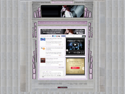
There aren't many pictures of Florence on her web page, just a slide show at the top. This conforms to the indie conventions that image isn't as important as the music.
There are links to social networking sites such as facebook, twitter, myspace and youtube. There is also a live twitter feed at the bottom of the page. 
To get onto the website you have an entry screen which advertises her latest concert, so you have to see this before you enter the website. The website has a very simple layout with her name and picture at the top and then a range of options and other information, its just simply one page which changes colour. When you open up her official website the first thing you see is her name, in the same font she always uses for her name and a slideshow of pictures of her underneath. Then underneath you have all the options you expect to see on an artists website, e.g News, Blog, Videos, Gallery, Store, etc and and one of her latest music videos. The layout is as if it is a stained glass window and she is in the middle. This could have a range of connotations. Where do you usually see stained glass windows, at churches, and who is usually on them, holy people. This could suggest that she thinks she is holy. The colours also keep changing which also lead me to believe it was meant to imitate a stained glass window, there are lots of colours on stained glass windows. 
The written content consists of latest news on Florence from sources like 4Music and BBC Radio. There isn't alot of writing on the homepage that the audience needs to read, everything is summed up. If you want to read more you can just click on the tabs, depending on what you want to know. 
The target audience of the website seems like it would be 16 - 19. Mainly because the layout is quite sophisticated, the changing colours and images give it a very classy look. It doesn't have alot of writing, which is good because people within this age bracket probably won't bother reading massive articles of writing. 
There are very few adverts on her web page. She has an advertisement for her songs on itunes, and there is an M&S advert but that's it. 
I don't think this does look like an indie pop website let alone a Florence and the Machine website :S
It seems to normal, its got a regular layout, and the colours are very pastel like and it isn't bold enough for Florence and the Machine. I expected from her website, for it to be very interactive with lots of wierd pictures from her videos. It is just not very Florence and doesn't seem like she has had alot of input into it. 


Lykke Li


There are lots of images. Lots of images of her and her merchandise and the magazines she has been featured on the cover of. All of the images are in black and white following the indie trend.
We can see her genre of music is indie because of the colours, layout and the content of the photos. She doesn't have images of her looking amazing in a bikini, they look like photos she has just took of herself in her back garden, giving it a very small scale and homely feel. The colour scheme of black and white conforms to the indie genre. 
There isn't alot of written content, there is mostly pictures representing links to the other pages of her website.
The layout is mostly vertical, its a very long page which you can't view all at once. The pictures are very big and take up alot of the space. I think the layout of Lykke Li's website is mostly to show how much work she does, it is also almost like a diary from day one, so it shows her career developing. This could be inspiring for her fans. 
There are no official adverts on her web page, only pictures of her merchandise which is sort of advertising but it isnt presented in an advert.
Links to social networking sites such as facebook, twitter and youtube. Also links to not so popular networking sites such as vimeo and spotify. She has more sites to connect too on her website than Florence which tells us that she isn't as popular and has to use a range of networking sites to get to different audiences. You can even listen to her music through the audio player provided on her website. 
The target audience for her web page is probably 17 - 19. All the hyperlinks are in one place so it is easy to find them and access them and there is plenty of visual material, because who wants to have to read through loads of writing.

Isabels Textual Analysis


Kristys Textual analysis


Nats Textual Analysis


Digipak Design Template

We know the image of the XX is dark but since the song 'You've got the love' is the highlight of the entire album, we'd like to make it like a special edition among all of the XX's albums.
This is mainly because the remix with Florence and the machine, we want to present this album contains more element than the previous ones. So we will have our cover partially black and white where paint/ neon paint on the background and on the artists' t-shirts are shown in their original coulours. This idea is inspired by the practice we did in AS when we were having tasters of A2 media. It represents the influx of new elements into the XX's songs.
Title of the album is written on T-shirts the aritsts wear.
A black and white photograph of two palms will be seen in our back cover, track list will be shown in different coulours which again represents the influx of exotic elements.
As palm is part of our skin, we'd like to have palms as a symbol of the nature of the XX while the couloured track list symbolises new elements painted on skin which refers to new elements in the XX's songs.
But for the inside sleeve and the CD, black will be the dominant coulour.
A black and white snapshot of 'You've got the love' music video will be put on the inside sleeve.
The CD will be white in coulour and we will see a mixture of colours on the 'X'.


Sunday, 28 October 2012

Media Studies Advanced Portfolio: Summer Homework

Coldplay

 What elements does your artist use to identify themselves in their videos?
The music video of Coldplay’s ‘Paradise’ is slightly different from their previous ones, the band members do not show up in the music video, instead, several people who wear elephant masks are the main characters in the video. Also, performance is a common element seen in Coldplay’s music videos, but the music video of ‘Paradise’ contains both storyline and performance. Furthermore, they give performance with music instruments in the video, this could be an illusion of the band Coldplay, but to be honest no one knows if the elephant men represent the band. But the performance and music instruments are enough to allow audience to identify this is a band’s music video. But the locations at the beginning of the video include London underground and Heathrow airport; these give us idea that it is a British band. Unlike ‘Paradise’, the music video of ‘Viva la vida’ contains only scenes with the band playing and close ups of the vocal. Similar to ‘Viva la vida’, other music videos of Coldplay tend to have performance in an open area included and close ups of the vocal, Martin. Location wise, urban area like London is often seen.

What genre are they? How do they compare to other artists from their genre?
Genre of the band is rock, but compare to other artists in the genre like Arctic Monkey, Coldplay could be something beyond rock. Since their music could be referred as pop, or more accurately, post-Britpop. For example, in the song ‘Viva la vida’, they use instruments like violin and cello which are not common in rock music, such application of music instruments of other genre is one of the evidences to Coldplay’s dynamic music.

How has your artist changed over time? Choose specific videos to analyse and compare.
‘Yellow’, produced in the year of 2000 presents a common structure of band music: a vocal, guitar, bass, and drum. However, when it comes to the year of 2012, more instruments are applied in Coldplay’s music to enrich their songs, such as the combination between rock instruments and classical instruments such as violin. The song ‘Paradise’ is one of the examples. In terms of music video, the video of ‘Yellow’ is a very simple one, there is only one filming location which is a beach with the vocal singing in front of the camera from beginning to end, and I bet very little editing is undergone in the video. However, in the music video of ‘Paradise’, loads of location is included, they could even film in a zoo and the tarmac of Heathrow airport; location outside the UK is even used as filming location like a huge exotic grassland. This indicates the music video is a huge production which also implies the status and popularity of Coldplay have experienced a significant change.

What generic conventions are evident from their videos?
In most of their music videos, performances are frequently seen, such as the band playing in a big open area like a music festival with fans yelling their name. Narrative is also seen in their music videos but less frequent than performance. Narrative tends to appear in their latest videos like ‘Princess of China’ and ‘Paradise’.

 Has the film style changed over time? If so why do you think it has changed?
There is a slight change of film style in their videos, more camera angles, editing and effects are included in their latest music videos. This is mainly because of their growing popularity and the record company they signed: Parlophone, a subsidiary of a major corporation EMI, thus they have the influence and could afford the cost of producing large productions.

What conventional mise-en-scene (costumes/ locations etc) are used in their music videos?
Urban filming locations like filthy streets in London, underground and garage are frequently seen in their music videos. Also, performance of the band is one of the conventions they frequently use; especially their performances in a big open area with fans singing with them. In terms of costumes, they don’t normally have special costumes and styles for their music videos but urban style: leather jackets, checked shirts, chinos and T-shits. These identify them as an alternative rock band.

How does your artist use camerawork, editing style and effects to create meaning?

In their early work, camerawork and editing style tend to be simple, not much effect is found in their early music videos, this could be comprehended as their main focus is on music rather than the quality of music videos, so pure performance videos are frequently seen in ‘Viva la vida’ and ‘Yellow’. But in their recent videos, narrative is put in their music videos, it allows the use of many camera angles, editing and effects.

For example, in the music video of ‘Paradise’, quite a few filming locations and possibly overseas are used in the video, long shots of the locations especially wide areas like grassland, nature are frequently seen. This might imply to the band’s definition of paradise, a wide, open area instead of urban, city or ‘concrete jungle’.

Close ups of the elephant’s depressed gesture when it is still locked in the zoo indicates the band’s rejection of being trapped no matter physically or mentally. So abundant long shots of the elephant running to escape from the trap are seen, this could interpreted as a process of getting out of the suffocating city or urban to the real ‘paradise’ where running freely and music playing are not restricted. But this ‘paradise’ is presented by an exotic location which implies the way to the real ‘paradise’ is to escape and step out of our comfort zone. Fast editing of the video gives us the sense of speed and time, ‘escape is the only way to our paradise’ is further presented, where escape can’t be undergone slowly. Furthermore, it also indicates that we should kick off our journey to paradise as soon as possible and the journey is destined to be riddled with process of lost and found, so we could see the elephant getting lost and running to nowhere through the fast editing.

Does your artist’s video’s relate to other media texts (Films, TV programmes etc) why does your artist do this?
No. Since Coldplay is a rock band rather than pop stars, it is clear that the focus should be on their music instead of their influence in the media. So this is why they don’t attach much of their music to films and TV programmes. Even if they do, it is not their main focusing point.

Activity Two: Photographs
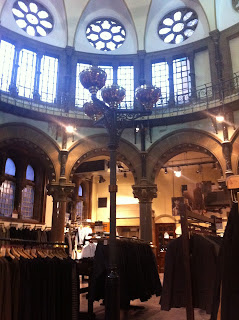
It is a location that looks like an abandoned chapel, where the band could do their performance part here. However, the location is actually a boutique so we will need to ask for permission to film here. If we can’t make use of the whole shop, we can just have our band standing in front of a wall that gives audience an impression that it is an abandoned chapel and some close ups of walls and decoration in the shop could make it looks like we are doing a performance in a chapel.


The pictures are taken in London underground, where tunnels and platform could be used for filming. We could have our band playing in tunnels as if they are street performers to depict an urban image of the band. Also, we could have one of the band members wandering through the platform like the Coldplay usually do for their videos.


The two boys in the picture are friends of mine, I think they would be suitable to act as two of the members in Coldplay because their figures and styles are resemble to the real Coldplay. Though the boy on the right is suited up, he wears this only because he was in a ceremony. When he is in casual wear, he matches the image of the band Coldplay.

Media Studies Advanced Portfolio: Digipak Design Research
Activity Two: Part one:


-Title
-track list

The latest album of Coldplay is very different from the albums of other artists in their same genre. There are only title and track list on the cover and back. This is a unique way to produce an album since institutional logos are seen as necessary on an album. This could be because of the status of the band in their record company allows them to have this unique presentation. The cover shows an abstract picture where a mixture of different coulours is seen, this could be interpreted as different elements the band has put into the songs in this album which allows audience to enjoy a wide range of music styles provided that music of Coldplay is getting more dynamic than their early works.

-Artist
-Title
-Track List
-Institutional logos

The album ‘Suck it and see’ of Arctic monkey adopts the traditional method to present an album where artist’s name, album title, track list and institutional logos are shown. This could be because the band is still in their process of development and their record company is still operating in a local scale which means the market is smaller than Coldplay’s. So the record company won’t take the risk of making the album too abstract since their target audience is probably niche audience in the UK while Coldplay is targeting the worldwide niche audience.


-Artist
-Title
-Track List
-Institutional logos
-Appropriate iconography

The pop rock band Lawson uses their own iconography as their album cover, it is not difficult to get the idea of them targeting their audience not only with their music but appearances. In the nutshell, pop music still dominates most of the music market, conceivably, rock bands transforming themselves as half-rock and half-pop is the most secure way to gain popularity.


-Artist
-Title
-Track List
-Institutional logos

Vampire weekend as a indie-rock band doesn’t need to make their appearances as one of the selling points. Evidenced by the cover of their album ‘Contra’, no iconography is shown and this draws audience’s attention back to their music.

Activity Two: Part Two

I’d use Photoshop to change the text on the symbol of Underground to Coldplay on its cover, then I would use the blur effect to blur the picture of motorway in order to make the glows on motorway form picture of mixture of coulours and glows. In terms of photographs, I will paint a picture with different coulours mixing together as the picture printed on CD. For the inside sleeve, I would take a picture of the inside of London Underground.


Thursday, 18 October 2012

Our Artists/Band


Song Lyrics

Sometimes I feel like throwing my hands up in the air
I know I can count on you
Sometimes I feel like saying "Lord I just don't care"
But you've got the love I need To see me through

Sometimes it seems that the going is just too rough
And things go wrong no matter what I do
Now and then it seems that life is just too much
But you've got the love I need to see me through

When food is gone you are my daily meal
When friends are gone I know my savior's love is real
Your love is real

You've got the love
You've got the love
You've got the love
You've got the love
You've got the love
You've got the love

Time after time I think "Oh Lord what's the use?"
Time after time I think it's just no good
Sooner or later in life, the things you love you loose
But you got the love I need to see me through

You've got the love
You've got the love
You've got the love
You've got the love
You've got the love
You've got the love

Sometimes I feel like throwing my hands up in the air
I know I can count on you
Sometimes I feel like saying "Lord I just don't care"
But you've got the love I need to see me through

You've got the love
You've got the love
You've got the love
You've got the love
You've got the love
You've got the love

Permission Email


This is the permission email we sent to The xx, to ask them if we could use their song "You got the love" remix.

Monday, 15 October 2012

Summer Homework - Activity Two Part Three

Activity Two: Part Three

(Apologies for the chewed up edge of the sheet, my guinea pig actually did eat my homework)


Summer Homework - Activity Two Part Two

Activity Two - Part Two

Florence and the Machine

The front cover of the album is quite plain but it gives you enough information. It tells you the artist and title of the album and also has an image of the artist. There isn't alot of detail on the front cover which is quite often the case with indie albums. The image is quite abstract and shows you the music inside could be quite soulful and indie. The back cover gives information of the track names, the record companies and other companies who helped produce it. There is also information on the sleeve of the cover, which tells you the album name and artist.

Other similar artists are:

Lana Del Rey

On this cover the name of the artist is in capital letters and in a large font, it is bigger than the name of the album. This suggests that the artist is more important than the album, it could possibly be because it is her first album under the name of Lana Del Rey and she wants people to notice her. The front cover is quite simple with only three pieces of information her name, her image and the album name. The back cover contains information such as the track names and production companies. The sleeve also features information such as artist, album title and also the record companies. 


Kate Nash


The Kate Nash CD cover features the artists name, album title and the artists image. But on this cover there is more detail and the artist is quite small. The image is quite conceptual as you have giant daisies, lots of horse shaped topiary and a cat on the roof of a giant and completely yellow house. I believe that through this image they are trying to tell you about Kate Nash and her style of music. For example she is quite girly as she likes horses and flowers but also has an element of madness as the cat is on the roof. The back cover of this album features the track names and record companies and the sleeve also features the album name, artist and record company logos. 

Marina and the Diamonds

 Again the front cover emphasizes the artist more than the album as there is a giant picture of her face in the covering the front section and the artists name is bigger than the album name. The back cover of this album case gives you the track names with information of copyright infringement and record companies on the bottom. Also on this case there is an actual image on the back case, it reminds me of being in a foreign country and chilling out which I suspect is the effect they wanted. The sleeve also features information of album title, artist name and logos oc companies that helped to produce the album.

All of these album covers have one thing in common which is that the front covers, the most important part of a CD cover, all feature an image of the artist, the album title and the artists name, which is often bigger than the album title. All these covers are quite simple and plain but get just the right information across, they also tell you about the artist in subtle ways, such as through the images.