Monday, 5 November 2012

Isabel Wong: Music Video Album Covers


Activity One – The Iconography of the Album Cover
The article talks about the industry of designing album cover where Julian House, a creative partner at London creative agency is interviewed. He talks about how the industry works: briefing session with record labels in order to collect information about what they want to be seen on the cover; then the most important part, have a conversation with the bands and artists, this is for the designers to find out more about the bands and artists in order to tailor make their CD covers with their unique characteristics and styles included. CD covers and inserts are very important since they are windows into the themes and ideas of the artist.
There are also various ways to deconstruct CD covers: target audiences, connotations, symbols and camerawork could be critical elements to look at.

Activity Two – Online Research – This Weeks Album Chart

1.      Calvin Harris – 18 Months
The cover uses a simple photography, this suggests to us that the songs of the artist are simple as well with less special effects put into the songs. As we see the blue sky on the cover, it might mean that the songs of the artists are not gloomy.


2.      Kylie Minogue – The Abbey Road Sessions
This album has a bold iconography of Kylie Minogue holding a microphone. This suggests to us that the album is likely to be promoted as a classic or masterpiece of the artist. The Black & White effect further consolidates how epic the album is.


3.      Emeli Sande – Our Version Of Events
By observing the dominant colour and costume on the cover, we might conceive the artist produces rock music.


4.      fun. – Some Nights
The band fun. is not on the cover where two unknown boy and girl are on the cover. But we’ve no idea of what they are doing. Title of the band is also not shown on the cover which makes the album difficult to be understood.


5.      Taylor Swift – Red
The cover is typical for Taylor Swift, because almost all of her albums have her iconography on the covers. But this is slightly different from the previous ones where Taylor’s lip is the focus of the cover. The colour red is frequently seen on Taylor’s makeup and outfit, so this could be a colour that represents Taylor. But this time the colour appears on Taylor’s lips, this could suggest that Taylor has had a breakthrough in her music style.


6.      Mick Hucknall – American Soul
There is a bold iconography of the artist singing in a studio. Such bold iconography means the album is very likely to be a masterpiece of the artist.


7.      Mumford & Sons – Babel
Iconography of the band is shown on the cover with a large party behind, we could then conceive the album is going to be quite cheerful. Different colours are included as well, so the music in the album might be dynamic in terms of style.


8. Matt Cardle – The Fire
Again, there is a bold iconography of the artist on the cover, collaborated with the element of fire, the album might relate to us that the songs are angry or deep.


9.      Paloma Faith – Fall to Grace
The album is amazing in terms of aesthetic, it just matches the album title ‘Fall to Grace’, there is really a feeling that we are going to be sucked down into the whirlpool of ‘Grace’.


10.  Madness – Oui Oui Si Si Ja Ja Da Da
There is no iconography of the band on the cover, and people might not know it is a music album when they first see it since there are just words on the cover. This might have something to do with the band’s image since they are called ‘Madness’.

Activity Three – Textual Analysis

The dominant colours on the cover are black and red which are gothic colours as well. The colours match the image of band which might be related to death. It might be more sensible to say black and red also stand for rock music or indie rock, this somehow tells the music inside the album to audiences. Furthermore, by observing and location, costumes and props on the cover, it is not difficult for us to know that it a band. Since one of the band members is holding an electronic guitar which further consolidates the idea of the band plays rock music. Also, costumes the band members are wearing tend to be urban which presents their indie rock image. Fonts used on the cover are divided into two types, a clear and bold font type is used for the band’s title ‘THE KILLS’ while the font type used for the album title gives a creepy sense that matches the title ‘midnight’.

Activity Four – The Best and Worse Album Covers in the World


I personally quite like this album cover because of the style of photography. There is no album title and band name as well which arouse the interest of people when they are wandering around CD shops. The filter they use for the cover is the one I obsess the most since I am always wondering how to do it with my camera or Photoshop.


Ken – By Request Only
I can’t really find the worst CD cover among the selection since I think they are all the worst in the universe. But I chose this because I laughed out in front of the screen while I was checking out the blog. I know bold iconography could make the album becomes a classic or masterpiece for the artist, but I don’t get why they put two silly iconographies on the cover and that really makes no sense! 

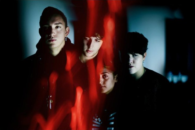
Activity Five – Homework: 5 images of my chosen band - The XX


Saturday, 3 November 2012

Website analysis research

Foster the People


  • Images and Logo
On the homepage of their website there is no image or logo of the band. They may have done this to make sure the website didn't look like a pop bands website and to add a clueless thought to what the bands image is like. It also could have been done to show the music is more important than the image. The only image conveyed on the homepage is a cartoon of people and torches. This is representing their album Foster the People - Torches, and has the exact same layout and image, this is a sign of promotion of their cd. 

  • Genre
The genre persued throughout their website is indie pop. This is because of the black, grey and white colours and also the simplicity of the layout. It also connotes a controversial side as the album cover is on the homepage which isn't usely done as their is a page about their albums, but however their is both. 

  • New technology and links
The website uses a lot of links to promote their band. The navigation bar includes several named links to pages so the fan surfing their website can go to a specific piece of information they wanted to look at. The navigation bar includes news, shows, music, photos, videos, journal, store. By the side of the title at the top of the page, there is a a media play button to play a song from their new album, this automatically promotes the album and song without clicking on it.

  • Colour and style
The overall colour and style of the artists website is very plain and simple. They have designed there website like this as they want to show that their music is more important than their image. The website doesn't give many clues away of what the band look like, but the audience/fans are able to see this through their videos and photos links. 

  • Written content
The written content shows the latest news and what the band are upto. But there isnt a lot of news as there is a link to look at more news. There isn't any other written content apart from the bands name and subtitles to keep it simple.

  • Font and layout
The font for both the bands name and the subtitles are very bold and clear to read, so this is good for the audience as they will find it easy to find what they want with clear labelling. The layout of the homepage is very clear, with every link under one another or linked on the navigation bar. This will attract the audience because if it was difficult to understand it would put them off. 

  • Target audience
The target audience for this webpage/band seems to be between 19-25 years old. I think this because it seems like it wouldn't attract a younger audience as it doesnt have bright colours or band images. I think it seems more mature with its basic and formal layout. I think this suits the target audience for the music aswell because i think its around the same age.

  • Advertisements
There are no advertisements on the Foster the people website, maybe this is done to keep it simple, but it could attract their audience if they did have some.

Fun


  • Images and logo
There are lots of images on the webpage, especially of the band itself which is very different to the other band. This attracts the audience straight away as they can relate to what the bands image is like. The images are very fun and silly which suits the name straight away. They have done this to give an impression to the audience that they are exactly what they say they are. The 'fun' logo is very original and different.

  • Genre
The genre of the music suits the webpage because it has a very indie look to it being simplistic and bold. We can also see that the genre is indie from the images and content. The style of the bands fashion suits their genre of music and the quirkyness of the layout on the webpage.

  • New technology and links
The Fun webpage uses lots of links to more news about their band and premotions. There is firstly a navigation bar hyperlinked with different pages including information about the band and latest news. There are also links to their songs on there new album, and access to buy the songs on itunes. There are also links on several pictures to look further into the information.

  • Colour and style
The overall colour and style of the website is very plain and dark. However, even though the background is black, the images posted of the band are very bright and loud. This shows their music is indie pop and there image is very colourful and this breaks the conventions of the stereotypical indie band. 

  • Written content
Firstly there is written content on their US and European tour dates next year, this premotes there tours and where there will be access to see them perform. There is also an image and a written piece on 'The Ally Coalition' which is a partnership they have made to raise awareness and funds to fight for LGBTQ equality. This shows there not only a famous band they help others aswell which gives a great impression.

  • Font and layout
Throughout the font is bold and white against the background of the webpage so it stands out clearly. Every part of the homepage is labelled with a subtitle for a clear understanding of what the info is. They layout is very clear with the navigation bar at the top and every other element of the webpage is underneath one another.

  • Target audience
I think the webpage for Fun has been directed at the same target audience their music is directed at. It is directed at a young age being between 16 and 25 as the colours and images draw the audience in. I also think with all the links to other pages and info of theirs introduces a young age with the technology.

  • Advertisements
There are lots of advertisements on the homepage of the site to premote their band and also other things that may be linked. There are links on itunes to download and buy their music which helps introduce to new fans what they sound like. There is also Fun merchandise which enables fans to buy clothes and other items from the band. There are links to festival line ups and advertisements of there band to gain popularity and fans.

Website Analysis & Research


Images & Logo (How is your band/ artist represented?)
Lenka is presented as very friendly by creative illustration appeared on both her website and music videos and the website's name 'Lenkaland'. It's like fans and everyone are welcome to enter Lenka's inner world with her music and illustration. With such comfortable image, Lenka's music is described as therapeutic. Also, the banner of the website shows Lenka sitting in a busy cities riddled with sky scrapers in her holiday outfit, this shows Lenka's music could be a relief for weary souls living in cities.

Genre (How are generic coventions of the music used?)
Lenka's music is mainly indie pop, this is because most of her musio is written by herself, and those songs are very optimistic and catchy. Pop music instruments like guitar, drums and piano are frequently heard in her music.

New Technology & Links
As seen in the screengrabbed image above, Lenka's Twitter is placed almost at a very eyecatching place where every visitors could see. This shoes Lenks' Twitter is where people could receive her latest news. Lenka even announced her wedding, pregnancy and birth of her child on Twitter. Besides Twitter, Lenka has her official page of Facebook, the biggest social network, this could help her to gain more popularity from the rest of the world since Twitter might not be that popular in other places like Asia. Lenka's music is also sold on Amazon and iTunes, selling MP3 online is a newly rised trend, so this is another way Lenka has her music distributed to larger markets.

Colour & Style (What does the overall colour & style of the site say about your artist?)
The dominant colour of the website is pink. Bright colours are frequently seen in Lenka's pictures, and albums and even website. For example, the profile picture of Lenka's Twitter is taken under pink glow. This suggests Lenka's style is sweet and cheerful. So as her outfits, pink is always included in her outfit. Besides colour, the website uses a simple design to present Lenka, this shows how uncomplicated Lenka's world and music are. It further supports the idea that Lenka is a simple and happy artist.

Written content (How does the written style reinforce the artist's image/ genre?)
There's no special written style to present the aritist's image, perhaps they just want to keep it simple to echoe the simple image of Lenka and her music.

Font and Layout (How do they construct the aritist's image?)
The make use of the simpliest font type to demonstrate Lenka's simple and happy image.
This also echoes the theme of her music which is 'simplicity is happiness'.
So simple layout is also used here, all the fundamental information about Lenka is shown in the website. But there is one thing missing which is her tour dates.

Target Audience (What techniques are used to target the audience?)
By observing Lenka's outfit and style, it is not difficult for us to think her target audience is teenagers. Teenage boys might like her because of her sweet appearance and voice while teenage girsl might like her because her outfits will tempt girls and her songs are so cheerful that girls can easily accept. Though her image and style seem to be youthful, but the vivacity in her music makes her a unique artist, audiences except professionals can also be her potential audiences since her songs are seen as therapeutic to the hectic people living in busy cities.

Advertisement (Are the advertisement suitable for the target audience?)
There is no advertisement on the website. This could be because of Lenka's simplicity,
she doesn't want her music to be marketed as a product otherwise her music will be very commercialised. So she prefers having no advertisement in order to keep the quality of her music since advertising might mean she has to be very productive.

Digipack cover research


2.Noah and the Whale

I think the the Noah and the Whale digipack suits the band itself very well. I think this as they have a very indie, controversial look about themselves, and the cd covers portray this. The off white colour of the background suits the vintage styling, and makes the cd look antique. The genre of the band, indie pop is strongly persued through the cd, using plain features and sticking to darker colouring.

The double exposure of the image of the band gives an interesting effect. It makes the cd look very alternative from other cds as many like to have a bold plain image to stand out to an audience. Noah and the Whales cd could challenge the stereotypes of an indie bands cd as the more plain the more effective.

The font and layout is very bold and would be easy for it to stand out against other cds. The bold lettering and large fonts of the bands name and the title of the album stands out significantly from the background of the cd.

The band have chose to set the image on the front cover. This works out very well as this will be the first bit of iconography the audience will see to draw them into buying the cd. Its straight forward showing all band members and introducing the band and the title of the cd. The style of the cd is overall vintage and has an indie style theme to suit the genre of music.

Overall, i really like this digipack, i like the use of the plain backgrounds, but i really like the theme throughout suiting the genre of music. I think the iconagraphy of the cd covers are quite effective as it is obviously aimed at an audience who enjoy indie pop music and the image is really effective with the double exposure which attracts the audiences eye straight away.

3.Our Digipack

From researching another Digipack i have a clear idea what i would like our digipack to include and look like. I think The xx digipack really needs to suit the genre as it the bands style of music isn't very clear and not as well known as others, attracting smaller niche audiences. So to attract their audience i would want to add a quirky look to the digipack but keeping it plain and simple like the style of their music.

For the mise-en-scene of our digipack we will use costumes to suit the genre, being quite plain and retro, the male singer wearing a leather jacket, jeans and a shirt, and the female singer wearing quirky skirts, jumpers and blouses. We have thought of several locations to shoot in, being a plain dark room, a warehouse, architects of air and woods. i think the best location for the cover of the digipack would be either a room or a warehouse, think they would both be effective by introducing the band, and there could be some printed images over the band which i borrowed the idea from the Noah and the Whale digipack image. As the band will be shown on the front cover, i think for the insert there could be lots of brights lights and coloured powder and paint being thrown as this is what appears in the music video.

As the background of the digipack is black i think the font for the writing should be white to make it look matching. I think the font should be in italics to give a quirky style and be slightly different to others. As the image of the band is going to be quite dark, we want the writing to be quite bold over the top so the focus isnt just of the appearance of the band.

The ideas of the darkness of the digipack with slightly quirky things such as the bright coloured insert will truely attract their targeted audience. I also think the image of the band will attract the audience as they can relate to what they look like and put a face to the voice. I think the simplicity of the The xx's digipack will be effective and sell the artists style of music.