How Effective Is The Combination Of Your Main Ancillary Texts?
 The xx's campaign is based on "black and white" colours and their logo, the X!
  We have added bright colours into our production, even the song we chose wasn't there usual tone, it is more upbeat and dancey. I think our campaign is more about selling the artists not just their music, which is something The xx stand for. A running theme throughout our digi pack and
 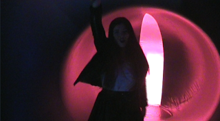 website was the X. As The xx already use the X to establish themselves we thought that it would be the best way to represent them as their fans would instantly recognise the X from our campaign and be drawn in. On the back of our digi pack we crossed the artists arms and made an X, also on the inside of the cover we blended an X over the artists. Because of the title of the song, you got the love, we thought it was appropriate to link the artists together with the X. Also on the website we used our own x's which we made on photoshop.
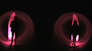 Another running theme throughout our campaign is colour. We used the colours to give an electric feel and to reflect from the music as it is remixed into a faster version than their usual songs. In our music video the main colours are red and blue, from the architects of air structure, alot of dark colours used such as blacks and red, we continued this theme onto our website where we have a picture of the inside of the architects of air as the background and have used alot of red and black colours. The CD also has a picture of the inside of the architects of air on it.
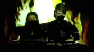
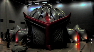 Our target audience is 17 - 21, the images we have created are of partying and just having a good time, 17 - 21 is the age where you begin to get freedom and go out partying and having a good time.
The purpose of our campaign is to connect with the audience.
 Our website would be accessed by our target audience and used as a bridge between the artist and their fans, it is a way for the fans to connect with their favourite artists, it also sells the band to new audiences. The album cover is used to sell their music, anyone who doesn't know The xx will need an appealing cover to make them want to pick it up and find out more.


The xx - Coexist


The X is their trademark!
They use it on their merchandise, website and on all their albums. There is one main picture on the front of The xx's most recent album, no writing to tell us who it is. This tells you that their album is aimed at current fans, they expect people to recognise their trademark. This conforms
to the indie convention, only the music is important, not the artists. Our album cover challenges this convention as we have used out artists for the front of our cover, we did this because we felt like it matched the title of our album/track.

Often on indie albums the colours are black and white, The xx's cover is very bright, a white background, with the X filled in with pinks, yellows and blues. They break this convention by having so many bright colours, but it only makes their album recognizable and distinct from other indie albums. We conformed to this convention as both the back and front cover are in black and white.
 The back cover of The xx's album carries on the same pattern.
The background colour is white, the same as the front. The writing is in black, so it stands out on the white background. The songs are written vertically and go down in a line labelled with numbers. The songs are also in capital letters, we continued this convention only we had the tracklist going down the centre of the cover.
On the bottom of the album there is a bar code and a trade marks from the recording company, it also has their official website on it as well. We copied this by adding a bar code and a recording label.
 The CD also follows the same design as the rest of the digi pack, it is the same as the front cover of the album, unlike our CD inside cover which portrays a pop/dance theme as vibrant colours are used. We wanted the outside cover to conform to The xx conventions to attract the attention of their fans but the inside is all about the remix between Florence and The xx, it was difficult to find a balance between the two completely different artists.
The xx Website

The website follows the same design as their latest album. A plain white background with a giant X filled with colour. The links to their other pages are across the top in the same font and same style, they are all in capital letters. Their latest activity is advertised at top and bottom of the page, but in the same font and style, it doesn't stand out, it just mellows in with the rest of the page. Again the layout is very basic, not too much stuff on the front page, the image also sticks in your head so you would recognize their logo again. You also don't need to scroll down the page, it all fits onto one, we tried to make ours similar to this as we think it is easier to view. Our web page is the complete opposite end of the spectrum. Our website is very socially and advertisement based. We have a live twitter feed, their latest news updates, concert info and advertising of our album, our website differs from theirs because ours is more about getting people to know The xx, finding out more about them and seeing them.

From the general layout of their digi pack is very basic and the colours are very light and express the bands image, as their music is very chilled and relaxed. This is about the only information you can get from their digi pack as their are no images to give away the artists identity, we can't see what they look like or what they wear. The xx's digi pack requires you too already have knowledge on the band before.

Florence and the Machine - Lungs

Florence and the Machines album obviously has one running theme running right through it, it's all about lungs! By using the image of the lungs it directly links with the album and songs on the album. This promotes the music as well as the image.
This album cover conforms to the pop convention of the artist being a key part of selling the music. She is on the cover and on the inside cover, in the same way our artists are on our cover and inside cover.
The cover of this album also contains more information than The xx's, such as the title of the artist and the title of the album, our album also contains the same amount of information.
The colours are quite mismatched on this album, some of it is in black and white and other parts in colour but it still works as an album. The colours on our digi pack are quite mismatched too but this was too incorporate the pop element of the song.
Florence and the Machines Website

The name of the artist is found directly at the top of the page and underneath is pictures of the artist herself. The layout of the page is similar to The xx's, all the hyperlinks are at the top of the page, it's just there is more content on the front page.
As The xx are all about the music, not the artist, it is clear that Florence doesn't follow the same conventions as the content of her page is all about her, advertising her music and advertising her latest tours.
We created our web page also based on the advertising aspect and getting our target audience more involved with the artists.
Florences website is quite interactive with youtube videos of her latest songs, itunes adverts encouraging you to buy her latest songs and albums, links to social networking sites, latest news updates and a live twitter feed, we also have all these things on our website. This is to keep up with the latest technology so we can keep fans updated and interact with them. Technology is getting better and it is easier to get songs of sites like itunes rather than buy an actual cd. It is part of promotion to get a bigger audience of fans and make themselves more well-known with people who haven’t heard of them, so using social networking sites is a fast way of reaching out to new fans.
No comments:
Post a Comment