Advanced Portfolio
Tuesday, 29 January 2013
A2 Advanced Portfolio: Reflection evaluation: Question 3
What Have You Learnt From Your Audience Feedback?
These are two questionnaires from our audience feedback
Weaknesses
Why is audience feedback important? how does it help you improve? who are your target audience?
Our target audience are both female and male 17-21 year olds. They are our target audience as they listen to the genre the xx are in being indie pop music. As we know what audience were aiming at it is easier to make our music video suit our audience and target them directly. Our audience is quite niche however there are some people that listen to this type of music but are not within our target audience.
Audience feedback is important because it helps us understand our strengths and weaknesses. It also helps us to know whether our music video appeals and suits our target audience. Audience feedback is better than our own feedback as they are honest and able to pick out strengths and weaknesses a lot easier. If we didn't have audience feedback we wouldn't know what is going wrong and what we have done good.
Our audience feedback can help us to improve on the weaknesses so we can change our video to suit our target audience. By improving our video this will give us a stronger and larger audience to aim at.
How did you gather audience feedback and what were the issues raised?
First we uploaded our music video on to Youtube.com because it was one of the easiest ways to share our video through technology. One of the advantages with using Youtube helps us see how many views the video gets and if any comments are posted about it. One of the disadvantages with using Youtube is our audience cant see our original quality of our music video. We also handed out a questionnaire to our target audience so they could rate the video and give feedback. This was effective to work out what grade boundary our music video falls into.
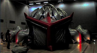
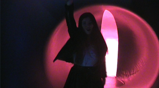
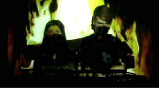
The first issue raised was the lighting was quite dark in specific places of the video. As you can see in this screengrab it is quite difficult to see the artists and see their lip syncing. To improve on this we could have used more lighting to brighten the clips. We could of also edited the clips more to get light into the clip, however in the Architects of Air we werent able to do this as the light reflected off the material so it didnt light up on the outside.
Another issue raised was the shaky camera at some points of our film, which we understand our camera wasnt steady on the tripod at some points however this was meant to happen. This was the style of video we wanted to do to make it seem more homemade and relaxed. Another issue was the bad dancing, which were unsure what this means exactly. At some points our artists felt awkward so we had to get them to feel more relaxed. Another issue our audience raised was the audio not matching the visuals, by this they may mean at some points we hadnt lip synced, but we wanted to give a variety of shots so it didnt seem simple and conventional.
Did you change your production to meet audience needs? What did you have to change?
The issues our audience raised were mainly about the dark lighting which is something which we would have had to do a complete re-shoot for. We were unable to do this because had to book architects of air which was a one off and had a lot of sorting out. Although we tried to meet our audience needs in every way possible this was the only way that didnt succeed.
Do you agree with the audience feedback? What are the possible problems of such a proccess?
On certain points highlighted by our audience we agree, such as the dark lighting comments. Obviously we understand our lighting is dark but alot of it is not at our fault as we had no idea what to expect with the architects of air structure. As for the multicoloured lighting scenes, it was our intent to make it dark. As the camera wasnt the best quality this may have been a bad idea to do because it seemed quite blurry and was very unclear to see any visuals.
The problems of asking people to fill out questionnaires is that they might not take it seriously and answer comedically, such as the bad dancing comment. Or the audience might not understand some of the technical references on our questionnaire. We tried to choose people from our target audience who would be interested in rating our video, although this, in some comments were not sure what they mean.
Monday, 28 January 2013
A2 Advanced Portfolio: Reflective Evaluation Question 2
How Effective Is The Combination Of Your Main Ancillary Texts?
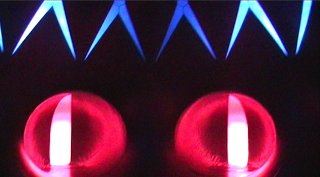 We have added bright colours into our production, even the song we chose wasn't there usual tone, it is more upbeat and dancey. I think our campaign is more about selling the artists not just their music, which is something The xx stand for. A running theme throughout our digi pack and
  website was the X. As The xx already use the X to establish themselves we thought that it would be the best way to represent them as their fans would instantly recognise the X from our campaign and be drawn in. On the back of our digi pack we crossed the artists arms and made an X, also on the inside of the cover we blended an X over the artists. Because of the title of the song, you got the love, we thought it was appropriate to link the artists together with the X. Also on the website we used our own x's which we made on photoshop.
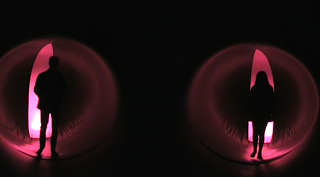 Another running theme throughout our campaign is colour. We used the colours to give an electric feel and to reflect from the music as it is remixed into a faster version than their usual songs. In our music video the main colours are red and blue, from the architects of air structure, alot of dark colours used such as blacks and red, we continued this theme onto our website where we have a picture of the inside of the architects of air as the background and have used alot of red and black colours. The CD also has a picture of the inside of the architects of air on it.
 Our target audience is 17 - 21, the images we have created are of partying and just having a good time, 17 - 21 is the age where you begin to get freedom and go out partying and having a good time.
The purpose of our campaign is to connect with the audience.
 Our website would be accessed by our target audience and used as a bridge between the artist and their fans, it is a way for the fans to connect with their favourite artists, it also sells the band to new audiences. The album cover is used to sell their music, anyone who doesn't know The xx will need an appealing cover to make them want to pick it up and find out more.
 The xx - Coexist
The X is their trademark!
They use it on their merchandise, website and on all their albums. There is one main picture on the front of The xx's most recent album, no writing to tell us who it is. This tells you that their album is aimed at current fans, they expect people to recognise their trademark. This conforms
to the indie convention, only the music is important, not the artists. Our album cover challenges this convention as we have used out artists for the front of our cover, we did this because we felt like it matched the title of our album/track.
Often on indie albums the colours are black and white, The xx's cover is very bright, a white background, with the X filled in with pinks, yellows and blues. They break this convention by having so many bright colours, but it only makes their album recognizable and distinct from other indie albums. We conformed to this convention as both the back and front cover are in black and white.
The background colour is white, the same as the front. The writing is in black, so it stands out on the white background. The songs are written vertically and go down in a line labelled with numbers. The songs are also in capital letters, we continued this convention only we had the tracklist going down the centre of the cover.
On the bottom of the album there is a bar code and a trade marks from the recording company, it also has their official website on it as well. We copied this by adding a bar code and a recording label.
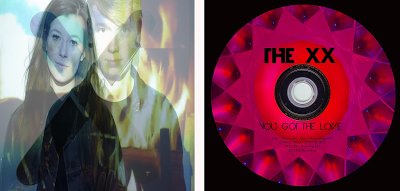 The CD also follows the same design as the rest of the digi pack, it is the same as the front cover of the album, unlike our CD inside cover which portrays a pop/dance theme as vibrant colours are used. We wanted the outside cover to conform to The xx conventions to attract the attention of their fans but the inside is all about the remix between Florence and The xx, it was difficult to find a balance between the two completely different artists.
The xx Website
The website follows the same design as their latest album. A plain white background with a giant X filled with colour. The links to their other pages are across the top in the same font and same style, they are all in capital letters. Their latest activity is advertised at top and bottom of the page, but in the same font and style, it doesn't stand out, it just mellows in with the rest of the page. Again the layout is very basic, not too much stuff on the front page, the image also sticks in your head so you would recognize their logo again. You also don't need to scroll down the page, it all fits onto one, we tried to make ours similar to this as we think it is easier to view. Our web page is the complete opposite end of the spectrum. Our website is very socially and advertisement based. We have a live twitter feed, their latest news updates, concert info and advertising of our album, our website differs from theirs because ours is more about getting people to know The xx, finding out more about them and seeing them.
From the general layout of their digi pack is very basic and the colours are very light and express the bands image, as their music is very chilled and relaxed. This is about the only information you can get from their digi pack as their are no images to give away the artists identity, we can't see what they look like or what they wear. The xx's digi pack requires you too already have knowledge on the band before.
Florence and the Machine - Lungs
Florence and the Machines album obviously has one running theme running right through it, it's all about lungs! By using the image of the lungs it directly links with the album and songs on the album. This promotes the music as well as the image.
This album cover conforms to the pop convention of the artist being a key part of selling the music. She is on the cover and on the inside cover, in the same way our artists are on our cover and inside cover.
The cover of this album also contains more information than The xx's, such as the title of the artist and the title of the album, our album also contains the same amount of information.
The colours are quite mismatched on this album, some of it is in black and white and other parts in colour but it still works as an album. The colours on our digi pack are quite mismatched too but this was too incorporate the pop element of the song.
Florence and the Machines Website
The name of the artist is found directly at the top of the page and underneath is pictures of the artist herself. The layout of the page is similar to The xx's, all the hyperlinks are at the top of the page, it's just there is more content on the front page.
As The xx are all about the music, not the artist, it is clear that Florence doesn't follow the same conventions as the content of her page is all about her, advertising her music and advertising her latest tours.
We created our web page also based on the advertising aspect and getting our target audience more involved with the artists.
Florences website is quite interactive with youtube videos of her latest songs, itunes adverts encouraging you to buy her latest songs and albums, links to social networking sites, latest news updates and a live twitter feed, we also have all these things on our website. This is to keep up with the latest technology so we can keep fans updated and interact with them. Technology is getting better and it is easier to get songs of sites like itunes rather than buy an actual cd. It is part of promotion to get a bigger audience of fans and make themselves more well-known with people who haven’t heard of them, so using social networking sites is a fast way of reaching out to new fans.
Sunday, 27 January 2013
A2 Advanced Portfolio: Reflective Evaluation Question 1
In What Ways Does Your Media Product Use, Develop Or Challenge Forms And Conventions Of Real Media Products?
The xx - Crytsalized and Florence & the Machine - Cosmic Love music videos' contain elements of mise en scene, camera, editing and narrative we wanted to capture for our own music video.
The xx - Crystalized
Florence and the Machine - Cosmic Love
Although these bands are from slightly different genres both of them have elements of their genre in our song of choice. We looked at different conventions they conform to in their videos and tried to incorporate elements from both.
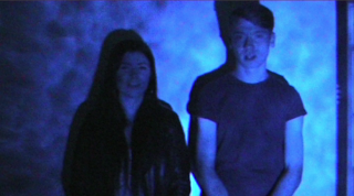 The projection screens over the artist in our video is greatly inspired by the the Crystalized music video.
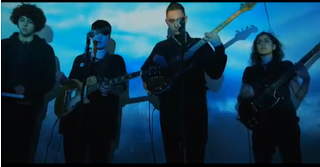 We analysed closely at their facial expressions and their body language but the band are quite emotionless, almost miserable. They don't put much emphasis into their performance on the videos, they just seem quite relaxed, which is a convention developed by The xx. We conformed to this convention because in the projection scenes we made sure they were effortlessly singing the lyrics so that the audience could recognize the artists as The xx.
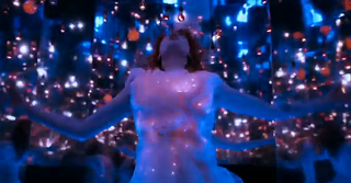 Another convention we conformed to in our video was the pop convention, used by Florence and the Machine in Cosmic Love. The lighting in Florence's music video is very brightly coloured, with lots of vibrant pinks and blues.
We wanted the audience to differentiate between the "black and white" xx scenes to vibrant Florence and the Machine scenes.
We used multi-coloured lights and strobe lighting in alot of the end scenes after Florence has been introduced into the song. In our song, the lyrics are slow and sang quite dull so the contrasting bright visuals would liven them up.
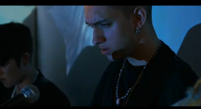 The camera work is what keeps the audience engaged in The xx's Crystalized video as their is no narrative and no other locations. The director uses straight cut transitions to close ups on the characters and pans across the band members, without the variety of shots this video would be very boring, just watching the same scene continuously. Similarly to this we used two cameras, one to film a master shot and the other from different angles and lengths to add a variety of shots into our video and also to enable us to edit the scenes together seamlessly, keeping the continuity when we want to go from a mid shot to a close up.

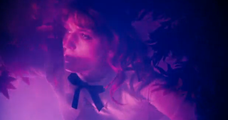 There is no specific narrative in Cosmic Love but there are different scenes which almost create a story, such as the scene where Florence is searching through the trees. Even though there isn't really a story-line to it, it still works as a music video, so we thought we could use this kind of narrative, with different scenes and locations intertwined to make a more interesting
video. Our music video doesn't have one specific narrative but we added shots of them entering and exploring the air structure to create short narratives within, similar to Florence and the Machines video.
As the band we are creating a video for is The xx we had too make sure they looked and dressed how The xx would. We dressed our male character in black skinny jeans and a plain tshirt. Our female character is dressed in a black leather jacket and a high-waisted leather skirt, so they are both wearing conventional, modern indie outfits. This is important so the audience can recognize the artists, the black outfits also aid to the visibility of the projections.
 The projection screens over the artist in our video is greatly inspired by the the Crystalized music video.
We wanted to create a similar atmosphere and impression of our band to our audience.
Atmosphere is easy to change and create through the variation of content we can project over our artists. For instance, when we project images of clouds moving onto our artist, it gives the audience a sense of calm; while the fire image projected over the artists creates sense of enthusiasm and vivacity.
 We analysed closely at their facial expressions and their body language but the band are quite emotionless, almost miserable. They don't put much emphasis into their performance on the videos, they just seem quite relaxed, which is a convention developed by The xx. We conformed to this convention because in the projection scenes we made sure they were effortlessly singing the lyrics so that the audience could recognize the artists as The xx.
 Another convention we conformed to in our video was the pop convention, used by Florence and the Machine in Cosmic Love. The lighting in Florence's music video is very brightly coloured, with lots of vibrant pinks and blues.
 We wanted the audience to differentiate between the "black and white" xx scenes to vibrant Florence and the Machine scenes.
We used multi-coloured lights and strobe lighting in alot of the end scenes after Florence has been introduced into the song. In our song, the lyrics are slow and sang quite dull so the contrasting bright visuals would liven them up.
We kept the locations of shooting quite unnatural and surreal, places that are not public, their isn't alot of people walking around, the locations are secluded and only for the band. There is only one location in crystalised, as there is in alot of xx videos, and they are quite studio/empty room locations. Florence uses a more locations in her videos but they are always quite strange such as in Cosmic Love she
 has a room full of mirrors, which create amazing effects as the lighting reflects off them. We conformed to the Florence convention of having quite out there locations and we filmed the majority of ours in a Architects of Air structure, which is not your usual, everyday location. We also incorporated The xx's location into it, we used a blank wall to film the projection scenes and the bright light scenes.
 has a room full of mirrors, which create amazing effects as the lighting reflects off them. We conformed to the Florence convention of having quite out there locations and we filmed the majority of ours in a Architects of Air structure, which is not your usual, everyday location. We also incorporated The xx's location into it, we used a blank wall to film the projection scenes and the bright light scenes.
  The camera work is what keeps the audience engaged in The xx's Crystalized video as their is no narrative and no other locations. The director uses straight cut transitions to close ups on the characters and pans across the band members, without the variety of shots this video would be very boring, just watching the same scene continuously. Similarly to this we used two cameras, one to film a master shot and the other from different angles and lengths to add a variety of shots into our video and also to enable us to edit the scenes together seamlessly, keeping the continuity when we want to go from a mid shot to a close up.
 There is no specific narrative in Cosmic Love but there are different scenes which almost create a story, such as the scene where Florence is searching through the trees. Even though there isn't really a story-line to it, it still works as a music video, so we thought we could use this kind of narrative, with different scenes and locations intertwined to make a more interesting
 video. Our music video doesn't have one specific narrative but we added shots of them entering and exploring the air structure to create short narratives within, similar to Florence and the Machines video.
The usual shot length in any music video is no longer than 2 seconds, in most of The xx's videos they break this rule with really long shots. We challenged this convention developed by The xx as we felt like the song was generally more fast paced and needed faster cuts.
The editing keeps in time with the pace of the music, at first the shots are very long when the song is quite slow and as it gets into the remixed parts of our song we keep the shots in time with the music by using fast pace straight cuts.
You Got The Love - The xx
Wednesday, 16 January 2013
Thursday, 20 December 2012
CD
This is our final CD. The front and the back are the top two, and the inside sleeve and cd are the bottom two.
Final Website
I have posted these print-screens on our blog because it seems everytime we try and open our website up it rearranges itself so things don't look right and how they should be. This is how our website should look now it is finished. The only difference is the background scrolls with the foreground so you wouldn't see the two circle images, just the one.
Subscribe to:
Posts (Atom)


